How to Style Picture Ledges: Decor Challenge Inspired by Stunning Shelves
How I turned shelf styling inspiration into picture ledge styling with autumn neutrals using my 8 design principles. Perfect for fall!
If you’re new here, we are all about bringing more joy into our lives by smoothing out stressors and creative problem solving. And today I’m sharing my surefire way to pull together stylish displays with my basic principles.
This simple checklist turns any angst you might feel into a game.
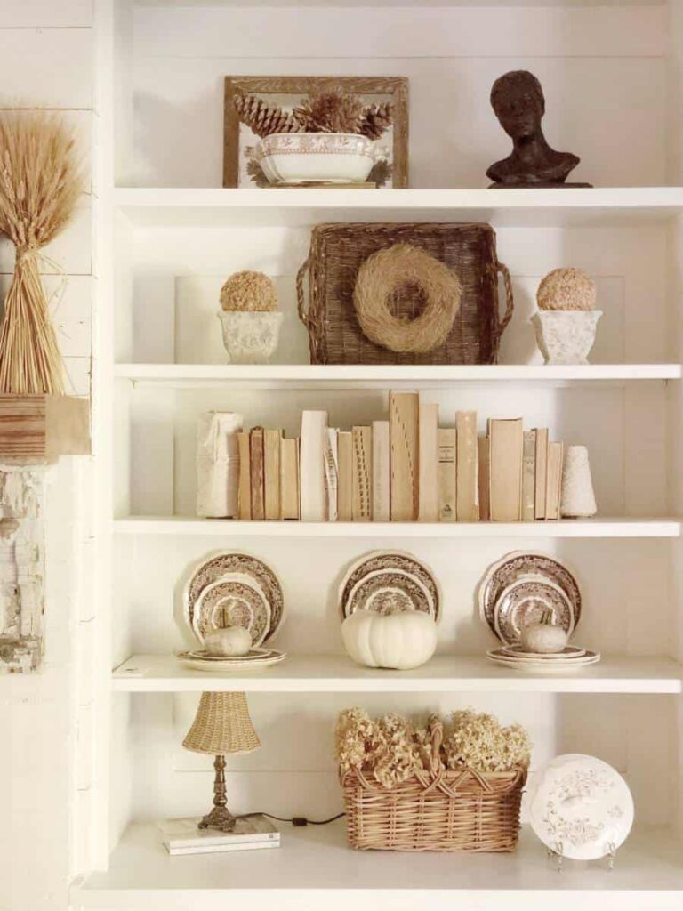
My inspiration came from one of my dear friends, Michele at Vintage Home Designs, who styled her built-in shelves with the dreamiest mix of neutrals—creamy whites, warm woods, soft textures.
It’s the kind of shelf styling that makes you want to light a candle, pour a cup of tea, and just sit and admire.
GREAT inspiration with only one small problem: I don’t have shelves! Not a single built-in in sight (but yes, that will be changing soon).
So mine are markedly different, because as I stated I have no big bookshelves. But I do have a wall of picture ledges in our family room.
And that got me thinking… could Michele’s stunning shelf styling inspire picture ledge styling? You bet it can. And with a few tweaks—hello autumn neutrals and gourds—it turned into one of my favorite little projects yet.
My ledges also have a little secret upgrade: a clever 3D twist for picture ledges that lets me display more than just frames. Genius, if I say so myself. 😉
Today I’ll walk you through how I took Michele’s inspiration and applied it to my picture ledges and my color style, using my trusty 8 design principles as a guide.
I’ll even grade us both (yep, teacher mode activated just in time for back-to-school!) so you can see how the same styling framework works across any style or surface.

TABLE OF CONTENTS:
My Trusty Styling Principles
Before I start arranging a single vase or frame, I always run through my 8 trusty styling principles.
They’re my secret sauce for pulling together vignettes that feel balanced, interesting, and intentional.
Whether I’m styling a coffee table, a spooky vignette, a bird cage (yes, really!), or today, a set of picture ledges—these principles never fail me.
South House Designs Style Principles for Great Vignette Building:
- Vary your textures
- Vary finishes — mix matte and glossy
- Mix linear and curved shapes
- Use a common color theme
- Add textile for softness
- Incorporate negative space — let things breathe
- Layer — build up and build out
- Aim for a triangular shape — always pleasing to the eye
Keep these in mind whenever you’re pulling a look together. They’re like a quiz you can give your styling before you call it “done.”
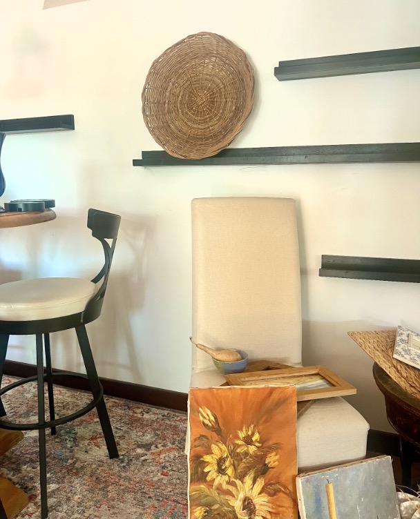
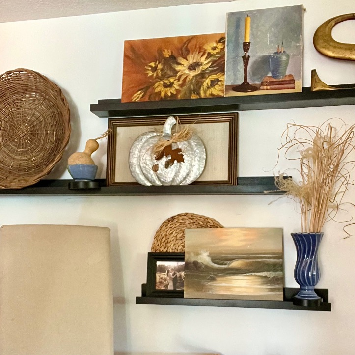
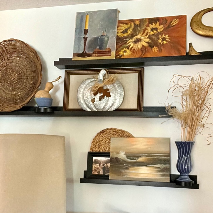
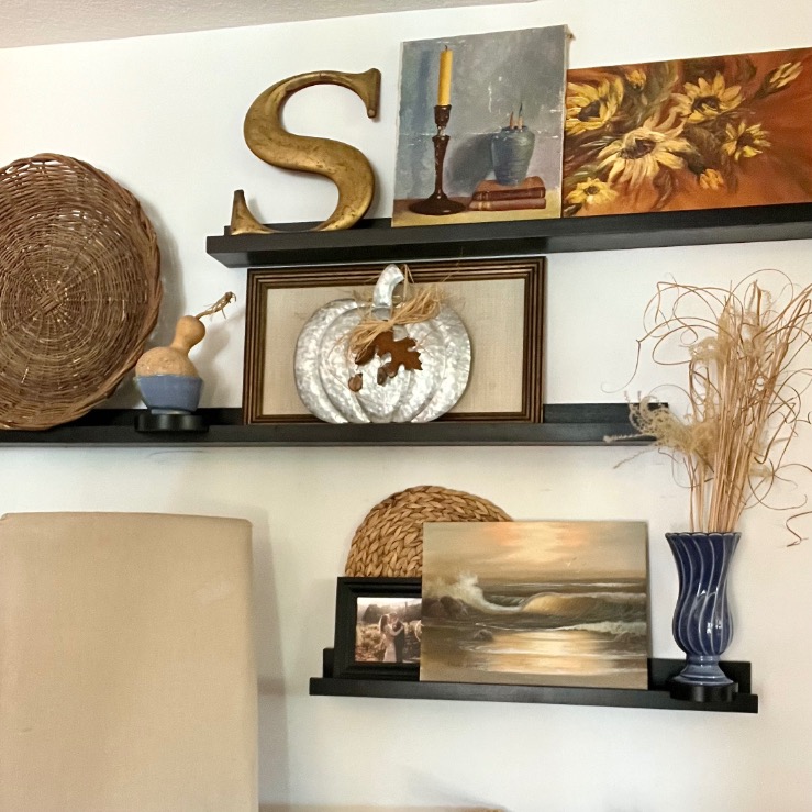
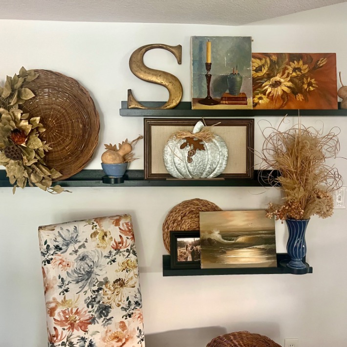
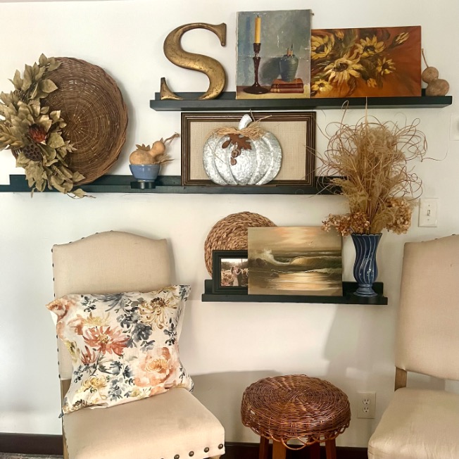
Quick backstory: this wall has always been a bit of a decorating sore spot. It sits at an angle, with a giant soffit overhead (enclosing a support beam we cannot touch). Built-ins would never work here—they’d just emphasize the wall’s short stature.
Several years ago, I solved it by building a set of custom picture ledges, arranged irregularly to best fit the quirks of the room. One sits higher, behind a tall game table, and three more stagger along the right side at varying lengths and heights. It’s not a perfectly symmetrical wall of shelves—and that’s exactly the point.
So when I style my ledges, I focus on the three main shelves, but always pull the lone high shelf into the overall arrangement so the whole wall feels connected. If your home has quirks too, take heart: they can actually become your best design feature.
Styling Picture Ledges Step by Step (Using My 8 Principles)
Whenever I style a vignette, I start the same way: gather more than you think you’ll need.
Shop your home—pull art, vessels, gourds, trays, baskets, books, textiles. Spread it all out. Having plenty of options means you can play until it clicks.
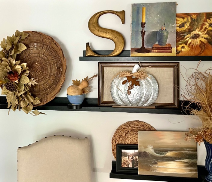
For this wall, I pulled together thrifted artwork (hello, original paintings I’ve been collecting), vessels, gourds, and a fabulous old wicker tray with a lovely patina from a recent thrifting basket bonanza.
That tray became my anchor—it gave me both scale and texture.
Whether you’re styling shelves, a mantel, or picture ledges, your largest item sets the stage.
PRO TIP: Your largest item, place it first, then build around it.
Then I started placing the oil and watercolor paintings I had collected, some framed and some not. I mixed and matched, moved them and swapped them until it felt right and ready for all the supporting cast that brings it to life.

I had two paintings that were too tall for any of the shelves on the right. But they did not work together on the single high shelf — too much visual weight on that one shelf (besides not looking good together anyway).
So I opted to moved the sunflower painting to the set of three shelves, but on its side so it would fit!
I hid the sunflower’s vase behind the predominantly blue painting, and you’d never know that wasn’t its correct orientation. Pretty Sneaky, right?
Once all the paintings were in the general area that I thought worked, I started feeding in additional fall goodness while walking through my 8 principles. Not in rigid order, but as a flexible checklist.
Sometimes one piece checks three boxes, sometimes you swap and swap again until suddenly it feels right. Here’s how it played out:
1. Vary Your Textures
If everything is smooth, it falls flat. If everything is rough, it feels heavy. Mix is magic.
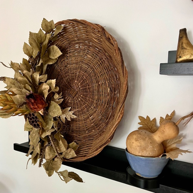
A wicker tray, glossy blue vase, rustic frames, and dried grasses all brought different tactile notes.
2. Vary Finishes (Matte + Glossy)
That subtle sheen difference keeps the eye moving and adds depth to a display.
I paired matte paintings with a shiny metal pumpkin, a glossy vase and bowl. Michele did this too—her shelves mix vintage glossy pottery and smooth pumpkins with dried hydrangeas, wicker and book pages.
Please excuse this brief pause in the action to ask if you’re subscribed to our newsletter. Full of exclusives and free goodies, the best tips and more.
Thank you! Now back to the ledges:
3. Mix Linear and Curved Shape
Frames are all linear, so I need curves for relief.
My MIL’s gold “S” brought just the right swoop and sentimental warmth. The blue vase and bowl along with the swirling grass all balance the sharp linear artwork
4. Use a Common Color Theme
Michele’s minimal use of color is spot on for Michele. But for my home and my style, color is where this vignette came alive.
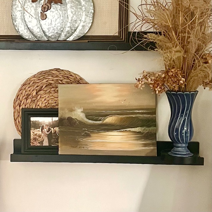
For my early fall display, I stuck to a common base of cream, warm browns, soothing ochres and gold. But I also wove in a smattering of my family room’s blue throughout the three main shelves.

And then I used the power of that blue to pull in the fourth shelf off to the left side. I added the watercolor scene (a wedding gift from my godparents) to make the whole wall cohesive.
It was the perfect tie in!
5. Add Textile for Softness
Even just a bow of raffia or a bit of woven fabric goes a long way.
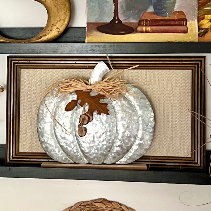
The metal pumpkin received a framed backdrop of a unique woven linen fabric, plus a bow of raffia. Add in the silk leaves on the wicker tray and you’ve hit the soft and cozy mark.
6. Incorporate Negative Space
Don’t be afraid of breathing room. The open air around it was just as important as the art itself.
I actually removed the waves painting from its dark, heavy frame to lighten the look and let it stand on its own. And Michele’s ? Lovely symmetry and margins all around!
7. Layers — Build Up and Build Out
Flat ledges can look like rows of soldiers if you’re not careful. Depth is what makes it feel collected, not cluttered.
I leaned paintings, tucked a placemat behind a frame, and used my 3D twist for picture ledges so some items reach forward.
8. Aim for a Triangular Shape
Triangles are naturally pleasing to the eye. With shelves in different spots and sizes, you might think it’s impossible—but color can also be triangle defining.
By spreading my blues into a triangle, the whole wall feels intentional and connected.
PRO TIP: Look at pieces from all sides, all directions. Art doesn’t always have to sit upright!
Even small adjustments can really mattered:
Stepping back, do you notice it?
The heaviest two blue items are both to the right.
And the sunflower painting and the framed pumpkin are roughly the same size and shape and perfectly lined up — not what we want.
So flipping the sunflower and blue candle painting helped with one, but I thought the blue triangle could still be a bit better.
So the gold “S” swapped places and now we have good balance and an effective triangle.
The sunflower painting looked too heavy upright and didn’t fit—but tipped on its side, it suddenly worked. Michele does this too—on her shelves, she used books backwards to show the warm edges of old pages rather than the spines. A fresh angle can unlock fresh solutions.
Next time you’re styling, remember: it’s not about getting it perfect on the first try. It’s about nudging, swapping, and tweaking until it feels right. That’s the magic of the process.
The Report Card: Michele’s Shelves vs. My Ledges
Because what fun is a decorating challenge if we don’t grade ourselves at the end?
Okay, so I might be just a bit competitive . . . (nothing motivates me quite like a grade).
Michele’s Neutral Shelves:
- Vary Textures → ✅ Ceramic, wood, woven, paper = A+
- Vary Finishes → ✅ Matte + glossy mix = A
- Linear + Curved → ✅ Balance of books and vessels = A
- Common Color Theme → ✅ Perfect neutral palette = A+
- Textile → (minimal, but not needed in her airy scheme) = B
- Negative Space → ✅ Gorgeous breathing room = A+
- Layers → ✅ Built up + out = A
- Triangular Shape → ✅ Subtle but effective, more of a grid = B+
My Picture Ledges:
- Vary Textures → ✅ Frames, pottery, woven, grass = A+
- Vary Finishes → ✅ Matte paintings + glossy ceramics + metallic = A
- Linear + Curved → ✅ Gourds and curling dried grass broke up the rectangles = A
- Common Color Theme → ✅ Neutrals with autumn warmth = A
- Textile → ✅ Added woven fabric but flat background + raffia bow for softness = A-
- Negative Space → ✅ Left room between frames = B
- Layers → ✅ Leaned paintings, used my 3D twist = A+
- Triangular Shape → ✅ Blues make a strong upward peak = A
👉 Final Score: Michele = Valedictorian of Neutrals. Me = An Honor Roll of Seasonal Flair.
Wrap-Up and Takeaway
So there you have it—my quirky family room wall of picture ledges, all dressed up in early autumn neutrals and graded (by me, of course) against my trusty 8 styling principles.
No shelves? No problem! A little creativity, a few swaps, and a lot of stepping back-and-forth later, and I’m loving how it all came together.
The best part? These ledges are so easy to tweak.
As Halloween creeps closer, I’ll layer in a few deeper tones and maybe another pumpkin or two. Maybe swap out the neutral grass for some branches of fall leaves.
By Thanksgiving, it will feel full and festive—without starting from scratch.
That’s the beauty of styling with principles rather than rigid rules.
SIDENOTE: what do you think about the chairs. Stay safe with the neutral or ramp it up a bit with the floral linen slipcovers. Post coming soon about making your own slipcovers for parson chairs.
Be sure you are subscribed so you don’t miss it!
I’m so glad you spent some time here today.
I hope to have you back again soon,

Diane your fall picture ledge styling is absolutely stunning! I may be able to style a plate rack, but picture ledges can be a little scary for me. Thank you for breaking it down, and explaining how you achieved this attractive and balanced display. The colors work so well together, and of course I love seeing the gourds! Hugs!
Love how you brought all these pieces together and styled them, Diane! And your explanation of how and why was so informative. Yes, triangulate those color pops. Love the blues with the fall colors. And that chair fabric is perfect; definitely whip up some slipcovers. I’ll be watching for that DIY:)
I’ve always enjoyed the look of ledge shelves. They seem so fun to decorate, so I think I need some! Yours look fantastic, and utilizing the chairs is a great idea. And I love the way you explained the process. Glad you were able to join us. Thank you! pinned
Thanks bunches Cindy! I truly appreciate all you do for this group and that you accommodated my ditzy brain!!!
Hi Diane, I’m visiting from hopping around the Pinterest challenge. I thought the idea of turning the sunflower picture on its side and “hiding” the vase was brilliant! Thank you for explaining your processes. I’m sure I’ll be visiting again soon.
Welcome Marilyn! I’m so happy to have you visiting and thrilled to hear that you enjoyed that little nugget of creative problem solving.
Diane,
You had me with picture ledge! Love how you have styled these for Fall, so pretty—happy almost Fall.
Diane, I love that you used picture shelves for this challenge, such a great idea and love the pop of warm fall colors!