How to Make Torn Paper Collage Art for Adult Beginners (Stunning DIY Wall Art)
Torn paper, a little glue, and a whole lot of creative freedom — that’s really all it takes to make gorgeous wall art you’ll be proud to frame. Landscapes, abstracts, still lifes — even stitching! See just how beautiful “beginner art” can be.
If you’ve been following along, you got a little sneak peek of this project in my recent art card post — and I promised we’d come back to it. Well, here we are!
Torn paper collage art is one of those creative techniques that sounds almost too simple — and then completely surprises you with how stunning the results can be. You can keep it as simple as torn paper and glue, or layer in a painted background like I do — either way, the results will delight you.
What I love most about this art form is how beautifully it scales. You can create a tiny, intimate piece matted and framed on your desk, or go big and bold on your wall. You can keep it clean and landscape-inspired — think mountains, rolling hills, a moody seascape — or throw the rules out entirely and let color and texture take over in a gorgeous abstract. You can even add stitching. Yes, stitching. More on that in a bit!
Whether you’re brand new to making art or just looking for a fresh creative outlet, this one is genuinely for you. Let’s make something beautiful.
The links in this post may include affiliate links, which means if you purchase anything using these links, you pay no extra, but I may receive a small commission that helps keep this blog running. I truly appreciate you using affiliate links whenever possible. Please know that I will never recommend a product I do not believe in!
Ready to jump right to it?
Here’s a Quick How-To Card for Confident Crafters
If you’d rather feel like I’m right by your side, stepping you through it — no problem, keep scrolling.
Torn Paper Collage Art
Materials
- Watercolor paper, 140 lb. (for background/mounting)
- OR mat board (for still lifes, botanicals, abstracts)
- Assorted papers for tearing (watercolor paper, scrapbook paper, specialty papers, or even fabric)
Tools
- Beacon's Zip Dry Paper Glue or a tape runner
- Ruler and rotary cutter, X-Acto knife, or scissors
- Paper clips (for holding layers in place while arranging)
- Bone folder (optional)
- Watercolors and brush (optional, for painting background)
Instructions
- Optional: Watercolor your papers for custom color
- Paint your sky background on watercolor paper and let dry completely
- Tear your paper shapes — more than you think you'll need
- Arrange and layer your composition, securing with paper clips
- Photograph your arrangement for reference
- Glue layers in place, working background to foreground
- Let dry completely, then trim to finished size
- Optional: Add machine or hand stitching
Notes
More details and tips are Included Below -- keep scrolling!

Detailed How-To With All my Torn Paper Art Hints and Tips:
Papers & Supplies-
The Paper
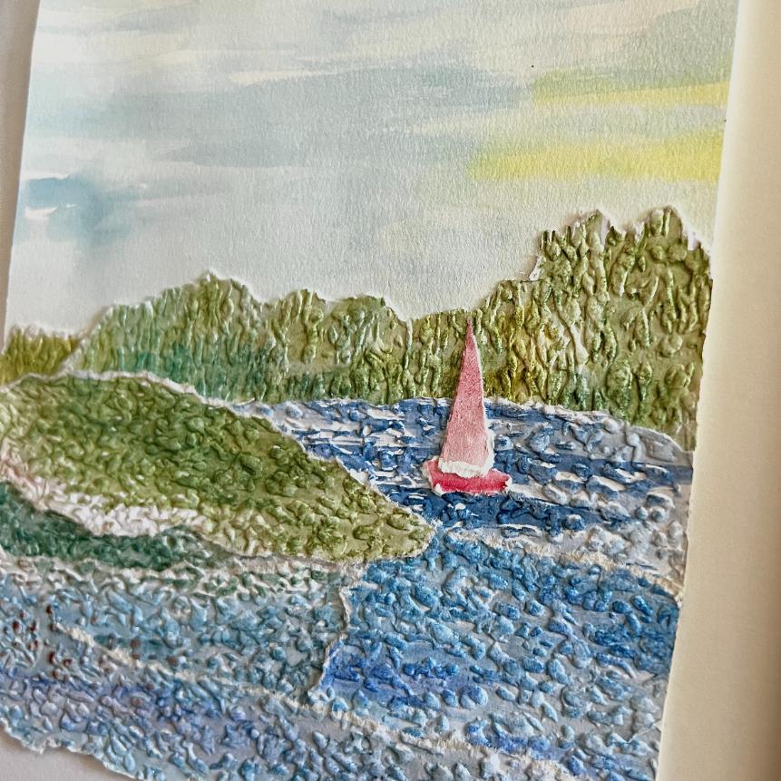
Any paper will do — and honestly, a mix of papers makes for the most interesting results. That said, I tend to lean toward papers with a bit of weight and texture. Watercolor paper (140 lb.) is my personal favorite, both for tearing and as my background and mounting surface. Paintable textured wallpaper is another great option that adds unexpected depth.
But don’t let that stop you from making it your own! Scrapbook paper, rice paper, vellum, and even handmade paper all bring something beautiful and unique to the mix. And if you really want to push the boundaries — try tearing in a few pieces of fabric. Yes, fabric. The frayed edges add the most wonderful texture.
Adhesives
This one matters more than you might think. I shy away from white glue — there’s simply too much water in it and paper has a tendency to pucker.
My strong recommendation? Beacon’s Zip Dry Paper Glue. It is an absolute dream to work with — reposition-able for a few seconds, dries quickly and flat, and bonds beautifully. If you already have a permanent tape runner on hand, by all means use it to get started. Both will work here.
Background & Mounting Surface
For landscapes, I paint a simple watercolor sky directly onto 140 lb. watercolor paper — this becomes both my background and my mounting board all in one. It’s my favorite approach and you’ll see it in action in the step-by-step below.
For still lifes, botanicals, and abstracts, mat board is a wonderful option. Your local art supply or framing store will have a great variety of colors and textures to choose from.
Tools
Good news — you really don’t need much here:
- A bone folder is optional — if you use one to smooth paper, just use a gentle touch so you don’t squeeze glue out from the edges
- A ruler and cutter — rotary, X-Acto, or scissors — for trimming to your final size
- Paper clips for holding your layers in place while you arrange
Five Ways to Tear
First things first, this is where the magic really begins.
The way you tear your paper has a significant impact on the finished look of your art — and using a mix of techniques in a single piece adds wonderful variety.
Grab some scrap paper and practice before you dive in!
A note on paper grain first: Paper made from wood fibers has a grain — and it matters.
Torn with the grain, paper tends to tear in a cleaner, straighter line. Torn against the grain, you get a more ragged, irregular edge.
Two easy ways to find your paper’s grain:
- The fold test: Roll two opposite edges toward each other and fold. Then try the other direction. Whichever folds more easily and cleanly? That’s the direction of the grain.
- The mist test: Lightly mist a small piece of paper (about 4×6″) on one side. As it dries, watch how it curls. It will curl parallel to the grain.
Tear 1: Up and Away vs. Down and Away
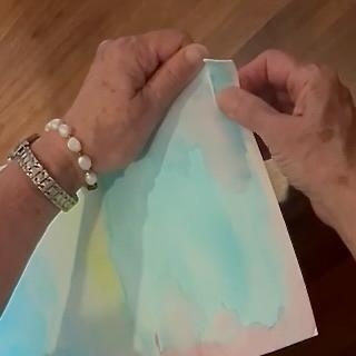
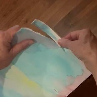
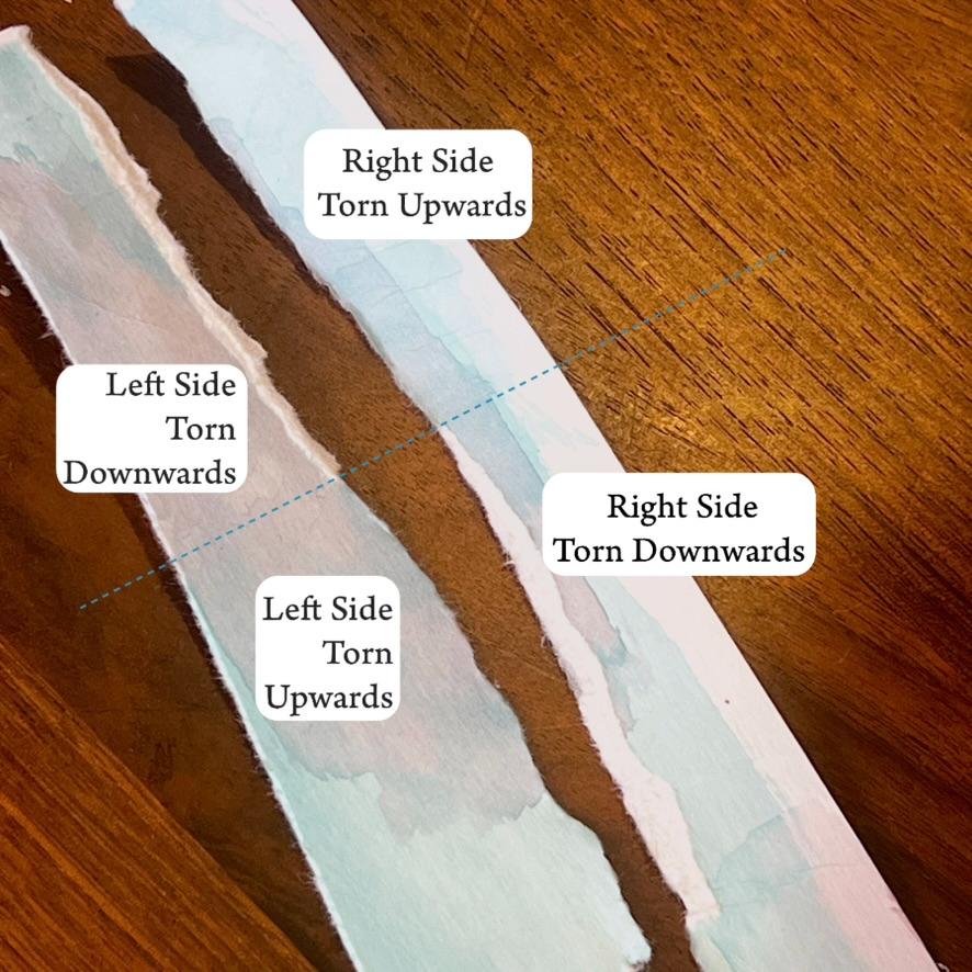
Hold your paper with both hands and tear the right side either up and away from the left, or down and away.
Depending on your paper, one direction will reveal a soft white torn edge — the other won’t.
That white edge is pure gold for suggesting wave crests, mountain ridges, highlights on a pumpkin, or the raised edge of a rolling hill.
Experiment with both directions and let the paper tell you what it wants to do.
Tear 2: Straight Edge Tear–
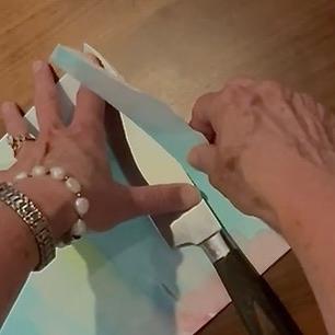
Place a ruler or straight edge firmly along your tear line and tear upward against it. With heavier papers like watercolor paper, this leaves a beautifully thin, clean line along the edge — perfect for crisp horizon lines or architectural elements. (I don’t typically suggest using a chef’s knife, it’s all I could quickly find at my daughter’s house)
NOTE: If you use a thin metal edge, it may leave a thin embossed line just inside the deckle edge. If this bothers you, consider the Wet Fold Tear.
Tear 3: Wet Fold Tear
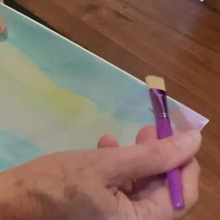
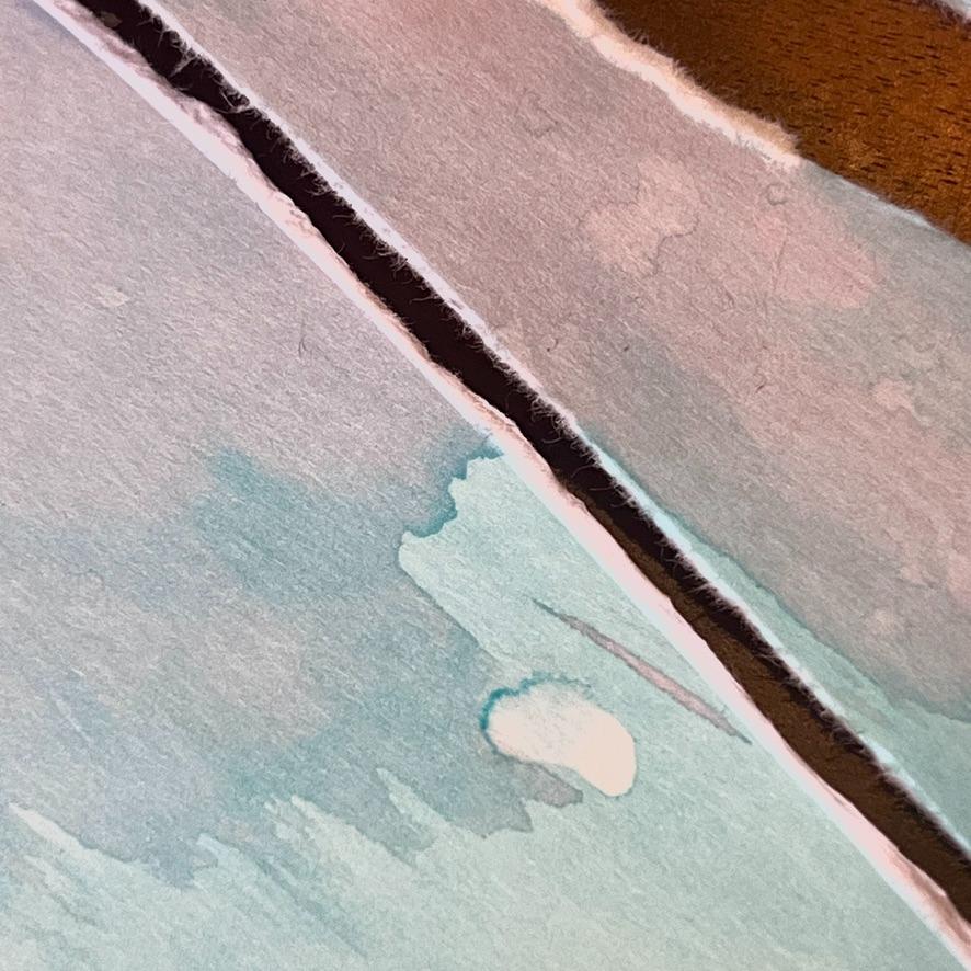
Score your fold line with a bone folder — this is one place it really earns its keep! — then run a wet paintbrush or your finger along the fold.
Open the paper and fold the opposite direction, wetting that side too.
Open and close in opposite directions several times to weaken the fibers.
Then hold your fingers close to the line and gently pull the two sides apart. The result is a soft, slightly irregular straight tear with beautiful character.
NOTE: If you are tearing a piece of watercolor painted paper, the water will most times remove or lighten the paint. Keep that in mind and optionally wet only on the backside of the paper, but still folding back and forth.
Tear 4: Drawn Water Line Tear
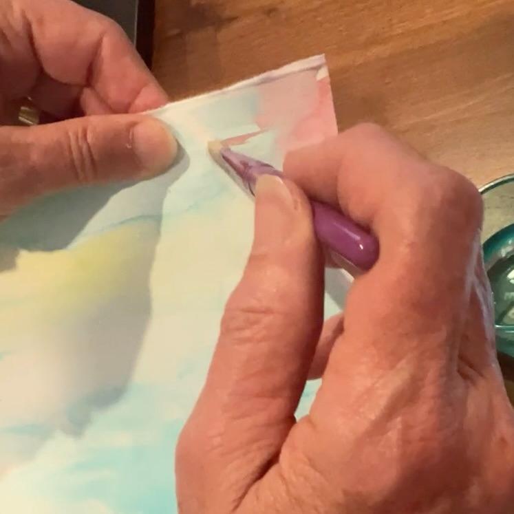
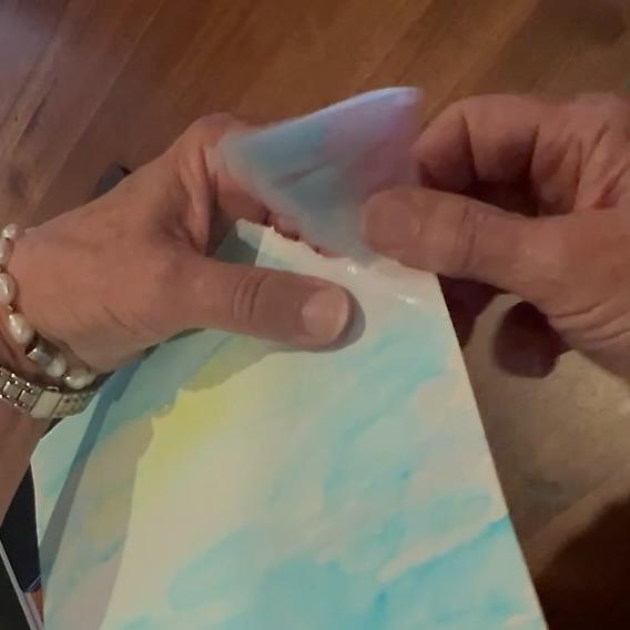
Using a watercolor brush or water marker, draw your tear line — curved or straight — and let the water soak in and weaken the fibers. Hold your fingers close to the line and tear along it.
This technique is wonderful for gentle curves like rolling hills, waves, or a soft horizon.
NOTE: This is great for isolating an element of a paper napkin or tissue paper design. Keep this in mind for decoupage projects, too.
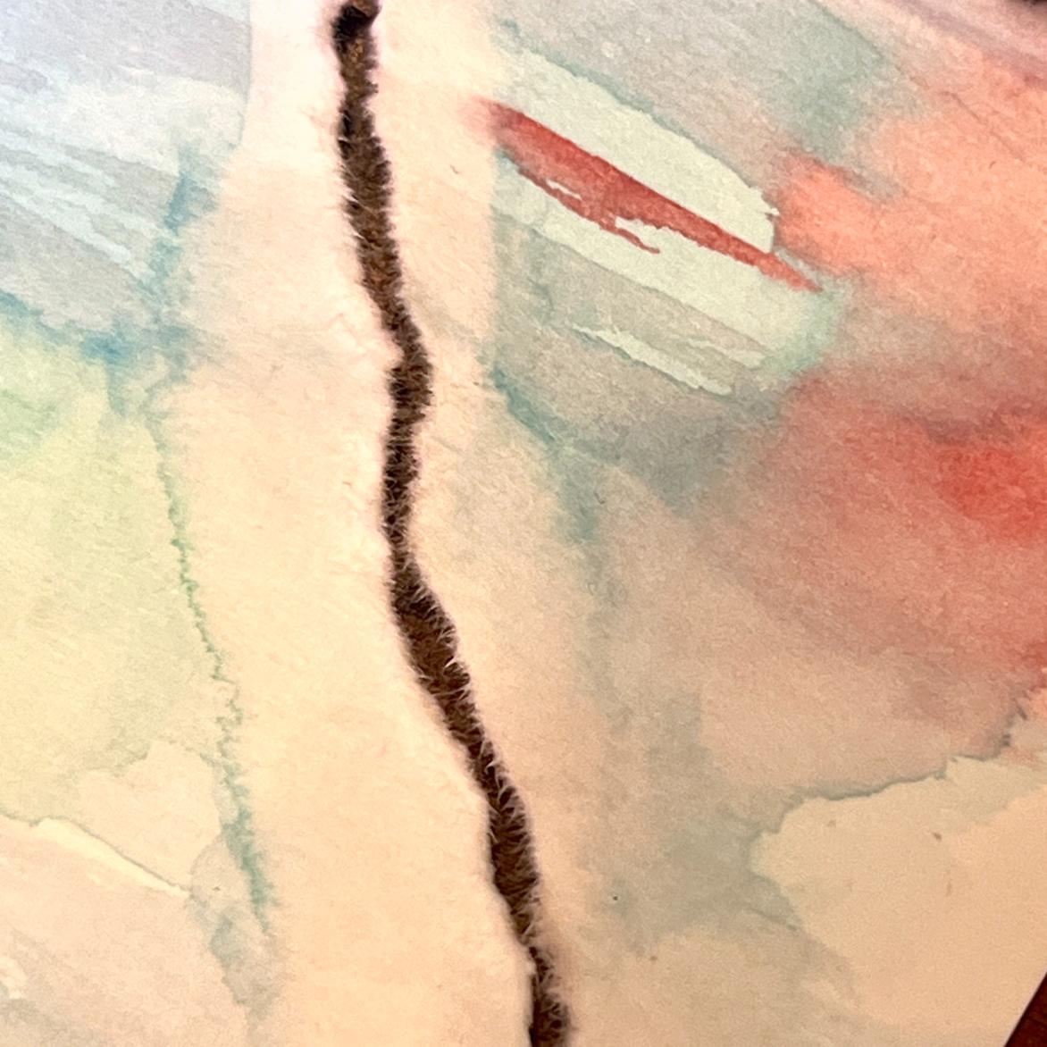
Tear 5: Bone Folder or Embossing Tool on a Soft Surface
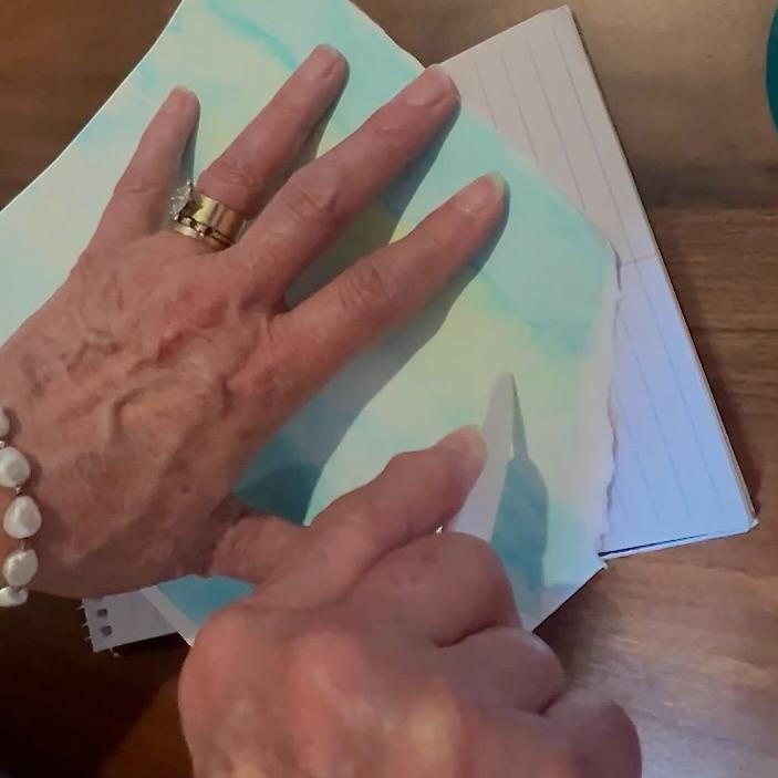
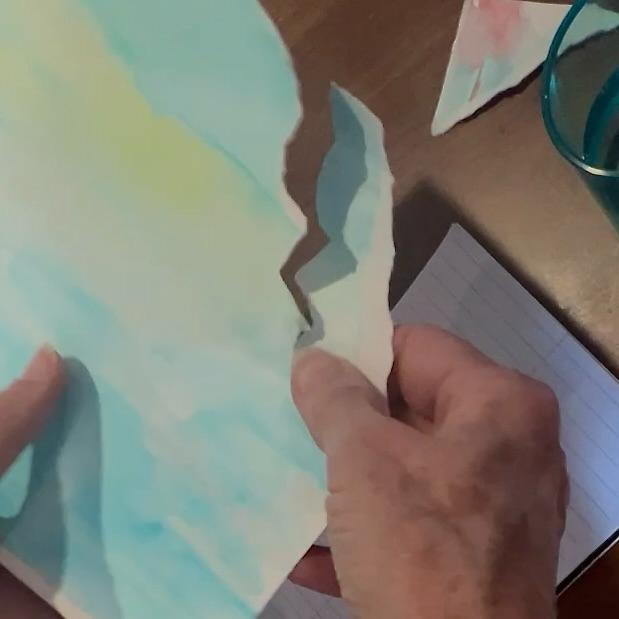
Place your paper on a soft surface — a piece of felt, craft foam or a pad of paper like I used here, all work perfectly.
Draw your tear line with a bone folder or embossing tool, pressing firmly to weaken the fibers, then tear along that line.
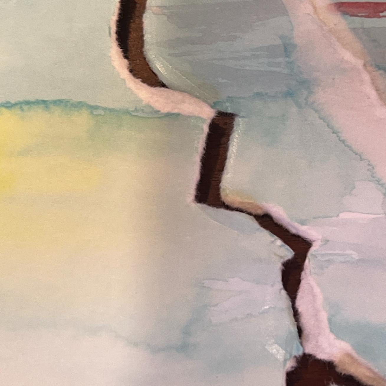
Practice this one first to see if you like the finished edge — every paper behaves a little differently. You can also combine this with Tear 4 for even more control over your line.
Bonus Tear Methods-
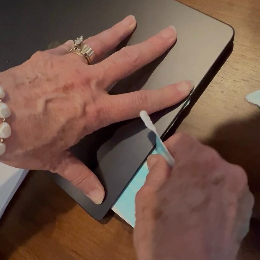
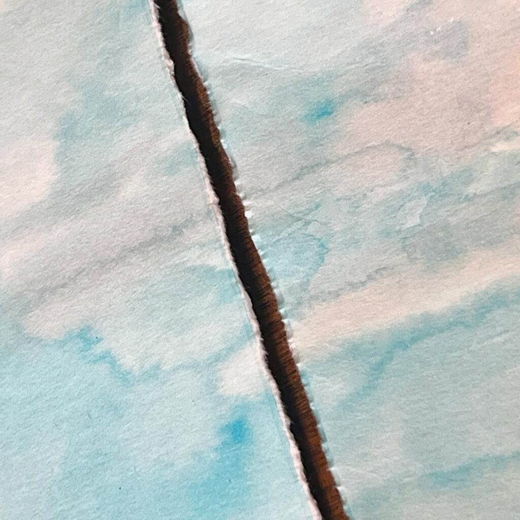
Improvise on the above methods. For Tear 2, the Straight Edge Tear, consider sandwiching your paper in your laptop.
Hold the lid tight and tear up against the lid for a straight line .
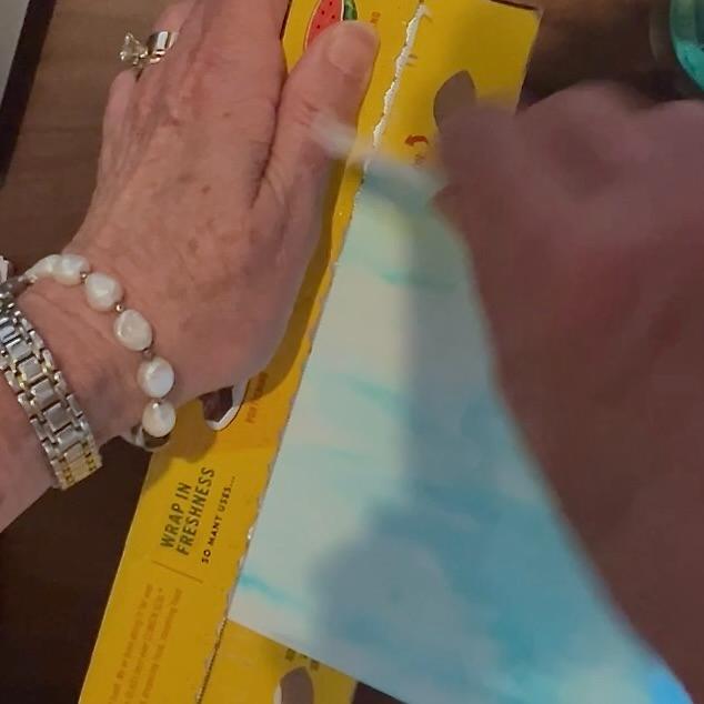
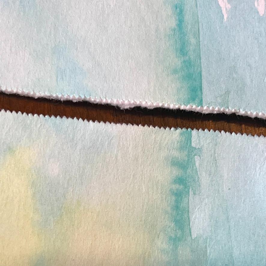
Alternatively use the blade edge of a box of kitchen plastic wrap, foil, or parchment paper for a straight tear with a tiny zig zag edge.
PRO TIP: Don’t limit yourself to just one technique per piece. Mixing tear styles within a single artwork adds depth, variety, and that handmade quality that makes torn paper collage so special.
What Should You Make?
Now that you know what torn paper can do, let’s talk about what to make with it. And honestly? The possibilities are wider than you might think.
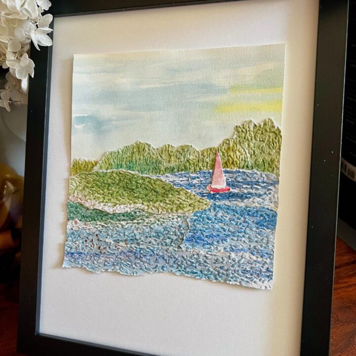
Landscapes are the natural starting point — and for good reason. The layered, organic nature of torn paper lends itself beautifully to mountains, rolling hills, farmland, moody seascapes, and lake scenes. By now you’ve seen how much a torn edge can suggest — and landscape is where those edges really shine.
Still lifes and botanicals are more approachable than you’d think once you start seeing subjects as simplified shapes. A lovely bowl of fruit. A branch of lemons. A single bloom. Think less about realism and more about what can be represented in layers of color, shape, and torn edge. (Psst — a full still life deep dive is coming in a future post!)
Abstracts are pure joy. No rules, no reference photo required — just a thoughtful, vibrant mix of colors, shapes, and textures until you have a composition that makes you happy. This is also a wonderful place to experiment freely with all five tearing techniques.
A simple sketch or reference photo is all you need to get started on a representational piece. Keep it simple — you’re translating shapes, not recreating a photograph. The torn paper will fill in the beauty all on its own.
A quick pause in this How-To to ask if you are enjoying this post. More where this came from. Join the South House family to not miss a thing . . . AND receive my free Creator’s Toolkit!
Step-By-Step
Step 1, Optional ) Custom Color Your Paper-
If you’re working with watercolor paper, consider this your invitation to play before a single piece is torn. Watercoloring your papers ahead of time opens up a whole world of custom color, and — this is the part I love most — it’s a beautiful opportunity to add visual texture through layering and blending that no store-bought paper can replicate.
Soft washes, bold saturated color, wet-on-wet blooms, variegated blends — all of that gorgeous watercolor unpredictability becomes part of your finished art. And when those papers are torn, the edges reveal even more of that color variation in the most unexpected, delightful ways.
If you go this route, do this first — before anything else. Let your papers dry completely before tearing or gluing. Wet paper tears unpredictably and glues unevenly, and all that beautiful work deserves to be fully dry before you put it to use.
Step 2) Paint Your Sky Background-
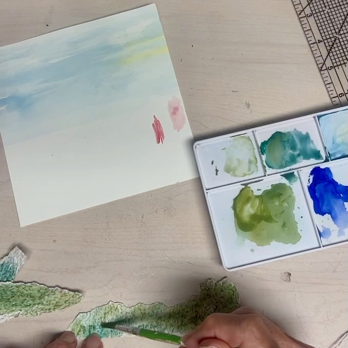
For a landscape, I like to start by painting a simple watercolor sky directly onto a piece of 140 lb. watercolor paper. This piece of paper does double duty — it’s both your background and your mounting board, so choose a size that works for your finished piece with a little wiggle room to trim later.
Keep the sky simple. Soft washes of color, maybe a little wet-on-wet blending for clouds or atmosphere. This isn’t the star of the show — your torn paper layers will take center stage. The sky is just setting the mood.
Once your sky is painted, step away and let it dry completely before moving on. I know, I know — it’s hard to wait! But wet watercolor paper warps, and you want a flat, stable surface to build your composition on.
Pro Tip: Paint a little more sky than you think you’ll need. When you start placing your torn layers, you’ll want the freedom to shift your composition left or right to highlight the most beautiful section of your sky. That extra inch or two gives you options.
Step 3) Tear Your Shapes-
Here’s where the fun really begins. Using your reference photo or sketch as a loose guide, start tearing your papers into the shapes you need — sky layers, mountain ridges, rolling hills, water, foreground.
One rule: tear more than you think you’ll need. Seriously, double it. Having an abundance of shapes to audition means you’ll always have options — a better curve, a more interesting edge, a color that works just a little bit better than your first pick. The extras are never wasted.
This is also the time to be intentional about how you tear. Refer back to your five techniques and think about what each edge needs to do. A soft horizon line calls for something different than a jagged mountain ridge or a gentle wave. Let your tearing be part of the design.
Pro Tip: Don’t be too precious about your shapes at this stage. Torn paper has a happy way of surprising you — a piece you tore without much thought often turns out to be exactly what the composition needed.
Step 4) Arrange and Layer-
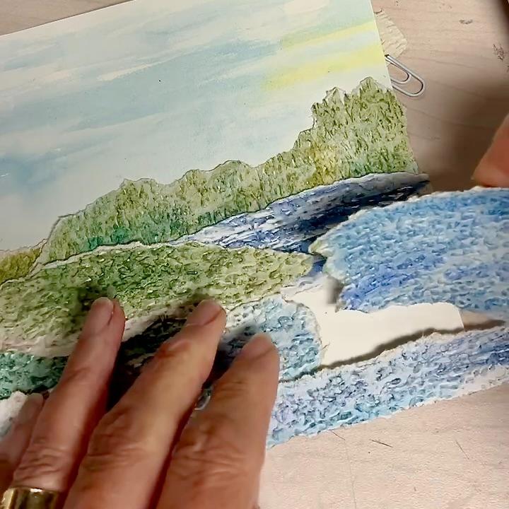
Now comes the deeply satisfying part — auditioning your torn pieces and building your composition. Place your sky background in front of you and start arranging your torn shapes, working from the background to the foreground. Overlap edges, shift pieces left and right, audition different shapes until you have something that makes you smile.
Don’t rush this step. This is where your art takes shape — literally. Move things around freely. A piece that doesn’t work in one spot may be perfect in another. When you’re happy with your arrangement, secure the layers in place with paper clips so nothing shifts.
Pro Tip: Step back and look at your composition from a little distance. Sometimes a few feet of breathing room gives you a clearer sense of the overall composition than staring at it up close.
Step 5) Photograph Your Composition-
Before you touch a single piece of glue — grab your phone and take a photo of your composition.
You’re about to dismantle everything to glue it down layer by layer, and that photo is your roadmap. Trust me, you’ll be grateful for it when you’re halfway through gluing and can’t quite remember where that one perfect piece was sitting.
Pro Tip: Look at your photo on screen before you start gluing. Sometimes a small screen gives you an even clearer sense of your overall composition — and it’s your last chance to make adjustments before things get permanent!
Step 6) Glue It Down-
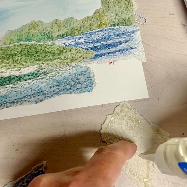
Now that you have your reference photo in hand, it’s time to make it permanent. Start with your background layer first and work your way forward toward the foreground. For a landscape, that typically means your most distant elements — a far mountain range, a distant treeline, a soft horizon — go down first, with each subsequent layer overlapping the one before it.
Pick up one piece at a time, apply your glue, and press it firmly in place. With Beacon’s Zip Dry you have a few seconds of repositionability, so don’t panic if something lands slightly off — gently lift and adjust. With a tape runner, placement is more permanent, so take an extra second before committing.
Work slowly and methodically. This isn’t a race, and careful gluing now means a beautiful, flat finished piece later. Once all your layers are glued down, set your piece aside and let it dry completely before moving on.
Pro Tip: If any edges lift slightly as the glue dries, place a heavy book or flat object gently on top of your piece while it dries. A little weight goes a long way toward a perfectly flat finished piece.
Step 7) Trim to Finished Size-
The home stretch! Once your piece is completely dry, it’s time to trim it down to your finished size. Remember that sky you painted a little larger than needed back in Step 2? Now’s the moment you’ll be glad you did — take your time and find the crop that shows off your composition at its very best before you commit to a cut.
Use a ruler and rotary cutter or X-Acto knife for the cleanest, straightest edge. A self-healing cutting mat underneath is your best friend here. Scissors work in a pinch but can be harder to keep perfectly straight on a larger piece.
PRO TIP: Use this photographers’ and painters’ trick: use two L-shaped pieces of paper or cardboard to frame your composition and audition different crops. Slide them around until you find the perfect frame.
Step 8, Optional ) Add Stitching-
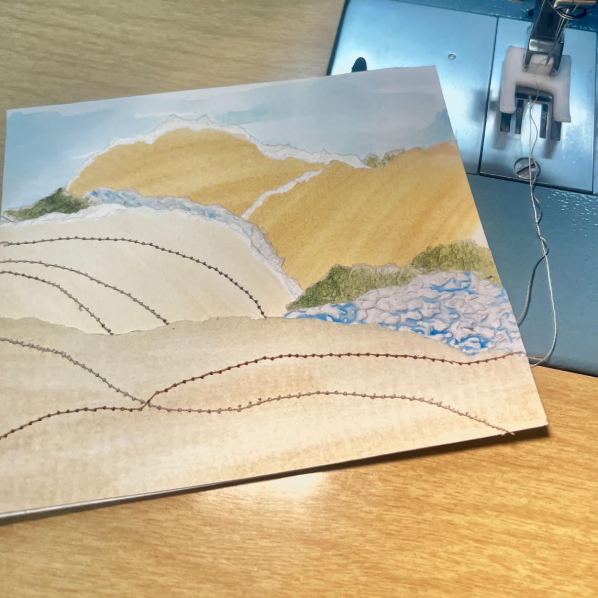
If you really want to take your torn paper collage to the next level, consider adding stitching. I know it sounds unexpected — thread on paper? — but the combination is absolutely gorgeous and adds a handmade warmth that is uniquely its own.
Machine stitching is wonderfully graphic. Simple straight lines or gentle curves stitched across your layers add a subtle but striking linear element that plays beautifully against all those organic torn edges. And once you see it, you can’t unsee it in the best possible way.
Hand stitching takes it in a softer, more intricate direction. Running stitches, French knots, simple embroidery — the possibilities are lovely. Ana Falceta is just one of many artists who create the most beautiful hand-stitched torn paper abstracts, and she even offers acrylic templates to help guide your stitching — worth a look for inspiration. (link)
A few practical notes:
- Your needle will leave holes in the paper, so stitch with intention — plan your lines before you start
- A sharp needle and a gentle hand are all you need
- Machine stitch with a slightly longer stitch length than you’d use on fabric — it perforates the paper less aggressively
PRO TIP: Stitching doesn’t have to stay within the borders of your art. Some of my favorite pieces I’ve seen extend the machine stitching out onto the mat — unexpected, modern, and so striking.
Finishing & Display
You made something beautiful — now let’s talk about showing it off!
To Mat or Not to Mat–
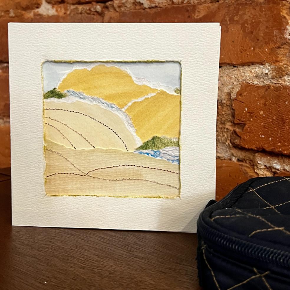
Matting is always a personal choice, but I will say this — a mat gives your art breathing room and elevates the finished piece in a way that’s hard to argue with. For torn paper collage especially, that white space around the art lets all those gorgeous edges and textures really sing.
And if you added stitching? Consider letting those stitch lines extend out onto the mat itself. It’s an unexpected, modern touch that absolutely stops people in their tracks.
The Floating Mount–
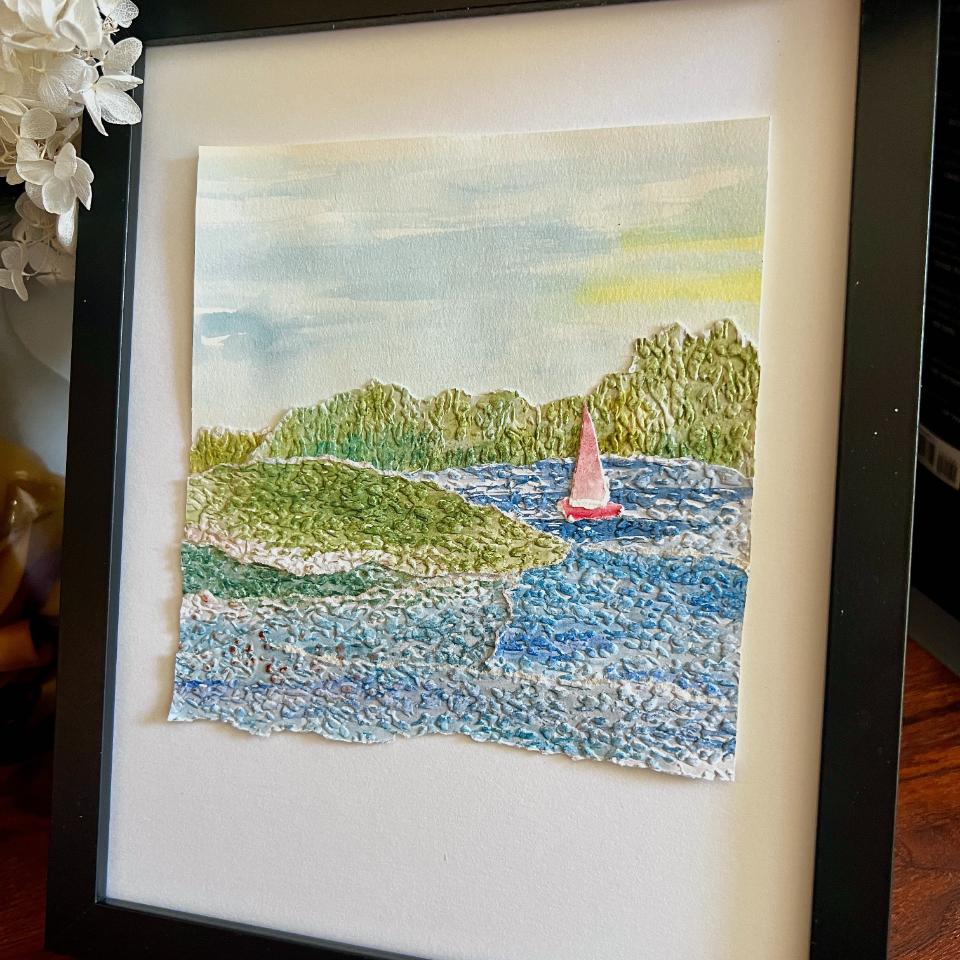
Another beautiful display option is mounting your finished piece as a floating mount on a larger piece of mat board — the art appears to float above the background with all four edges visible, including those lovely torn edges.
This works best for abstracts or singular subject pieces — a hanging guitar, a branch of lemons — where all four edges of your art are torn and part of the design. It’s less suited to landscapes where layers build up significantly at the edges. I have a full post on floating mount framing, if you’d like to give it a try.
Framing–
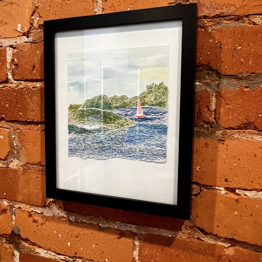
Standard frames work beautifully for matted pieces. For pieces with significant stitching or dimensional layers, just double check that your frame has enough depth to accommodate without flattening your work.
A Word on Sunlight–
If your finished piece will hang in a sunny spot or a window, use fade resistant papers from the start. Torn paper collage is too beautiful and too personal to fade before its time.
To Seal or Not to Seal–
Please don’t! I know it’s tempting, but sealing this art with varnish or Mod Podge would diminish the very thing that makes it special — the paper itself, with all its texture, its torn edges, its beautiful matte surface. Leave it as it is. It’s perfect just the way it is.
I know this was long with lots of detail. I hope it gives you the inspiration and confidence to explore this torn paper art form.
Thanks for hanging in with me and seeing this through to the end. I can’t wait to see what you make and I plan to add more of my own to this post. It is rather addicting.

More Projects to Enjoy