
Coral Bathroom – How to Find Right Coral Paint
Bathroom paint color can be tough, i.e. coral bathroom. Small single window rooms are hard. These tips will help you with any bathroom color.
If you’ve missed it, I’m a guest participant in the One Room Challenge, ORC. We challenge ourselves and encourage each other to transform a single room in eight weeks. This is it’s tenth year — and my first time!!!
Check out all of this year’s participants right here!
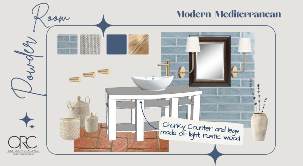
I’m, with the Hubs help, transforming our long, long overdue Powder Room. Check out the before and the plans here. And here’s a checklist for if you ever plan a wood-trim accent wall.
Progress So Far:
DemoAll the vanity components cut- Final placement holes drilled for faucet and water lines
- Vanity components finish and topcoat
Wall tiledTile drilled for mirror- Accent wall moulding cut and installed
- Accent wall caulked
- Accent wall painted
- Light fixtures refinished
- Lights installed
- Custom Baskets/Bins for vanity storage
- Urns
- Final wall treatment
- Window treatment
- Decor
WOW! Its doesn’t look like we have accomplished much, but several of the other are in the midst of completion.
Today is ALL About the Coral Paint-
And it is truly an explosion of corals here — leaning waaaay into the pink range.
As I mentioned on Instagram, anything with red is deceiving.
I’ve read and been told by multiple sources that red colorants are larger molecules (except red hair dye which is actually smaller and the reason that red hair fades quickest).
Supposedly this is why camera lenses have a harder time reading red. With my DSLR camera, I usually have to reduce the saturation of reds to get a true estimation of the color of whatever I am shooting. NOTE: all pictures here were taken with my iphone with no coloration edits.
It’s also why it takes more coats of red paint to get a solid red and more coats to cover a red wall.
Red tends to dominate. It grabs the spotlight and doesn’t like to give it up easily.
Maybe that’s why we have had such a hard time finding the right coral.
What Shade of Color is Coral?
Coral is between pink and orange, with all types of gradients and saturation levels!
When I look at this assortment, as a whole they appear more pink to my eye. Pull one out and it will look completely different.
How to Narrow Down the Coral That’s Right For You-
Start by determining the level of brilliance and vibrancy you want.
Is the wall color is to be the key statement for the room or is it a charming co-star? We didn’t even have any coral paint reference on the mood board.
Our focal point is the blue tile wall with its oversized mirror and the chunky vanity. The coral wall is to be the supporting cast — adding a bit of warmth and a smile.
I thought I wanted a “vivid” coral without being too bold and bright. But when I put some samples on the wall, they were much too bold and fought with blue tile wall.
Next determine your favored color “purity”-
Do you prefer pure colors, faded colors, muddy colors, etc?
Our homes should reflect us, the family that lives in it.
What kind of colors make you happy, bring you the greatest joy, or peace, or energy? What is it you want this particular room to convey to yourself, your family and your guests?
For us, joy and happiness is key!
Just saying, I am not into “muddy” colors. or moody colors for our home. They are lovely and I appreciate them. They just are not my/our happy colors.
I am a high energy, creative person, so you might think vivid, high energy colors would be right, but we have found that too much saturation tends to drain us. We feel best when surrounded with “our happy colors”.
Pretty Easy So Far, Right?
Now we get into the nuances of the colors.
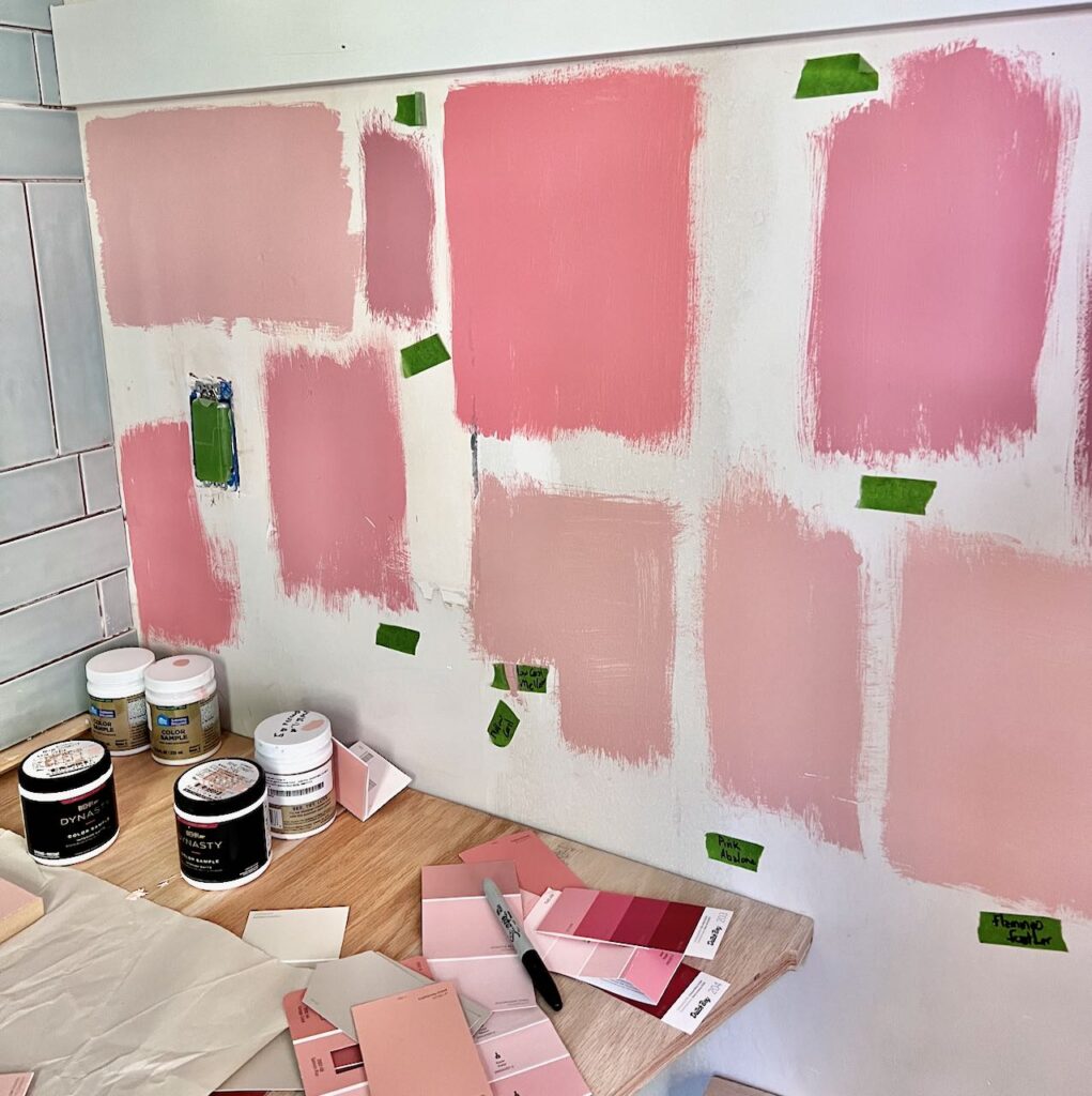
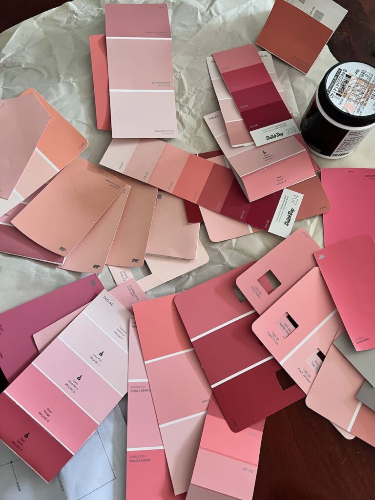
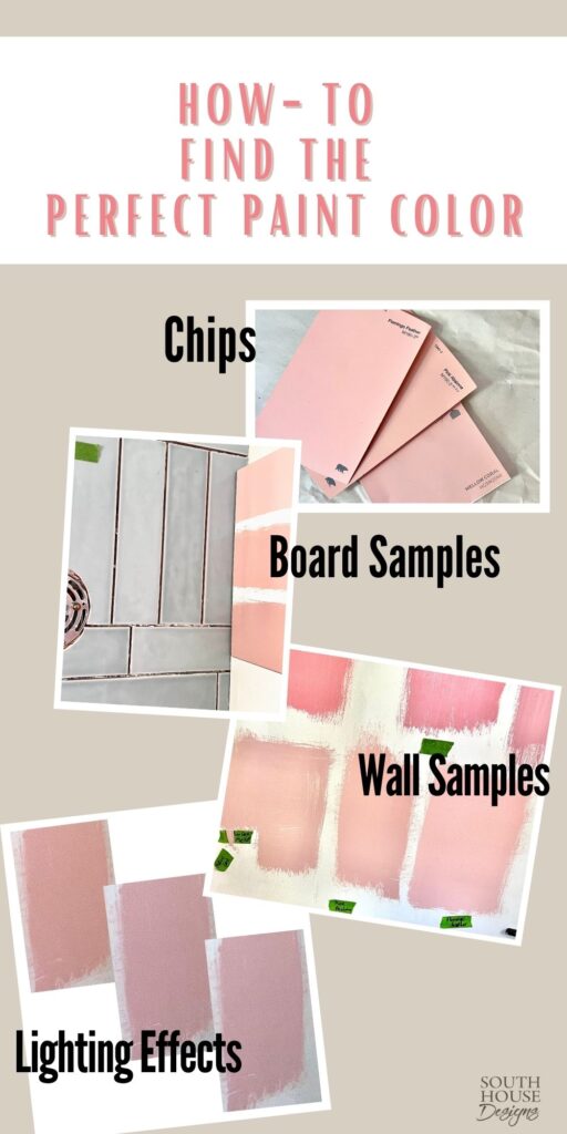
And this is where sampling is essential!
In the store, the paint chips look sooo different than they look at home. Take home a range that you think is close.
Just placing them on the wall they will be helps. For us, every color became more pink in our powder room!!!
Just looking at the chips, we confidently narrowed it down and started with one sample. Ha! Painted on the wall it became clear that it had a bit too pink (still), had a bit of a purple undertone and was muddier than we wanted. Yikes!
Back to the store, and again, and again!
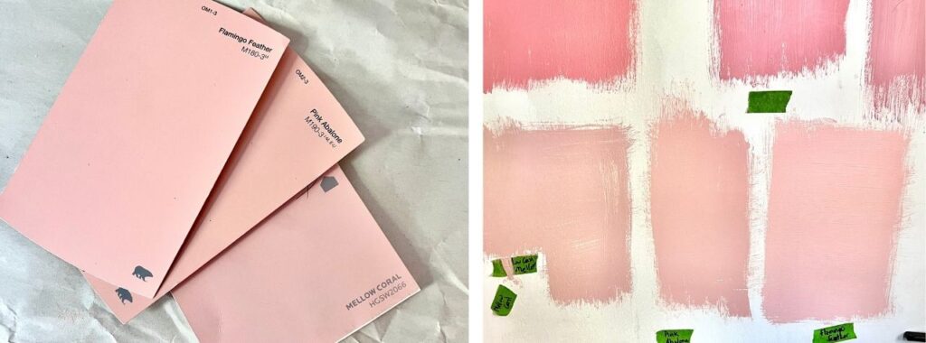
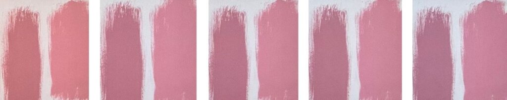
We finally ended up with these three chips, which looked very peachy and orange in the store. At home they looked very similar to each other and much more on the pink side of a soft coral.
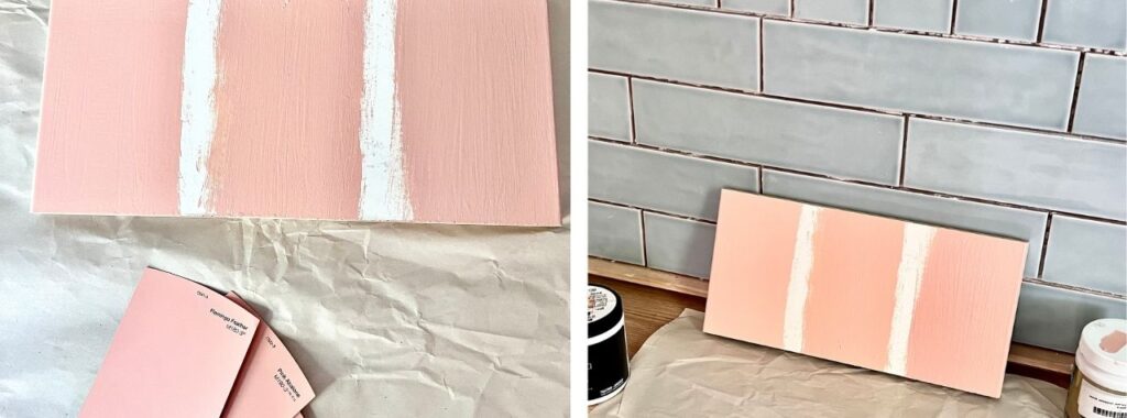
We painted a sample of each on a board we could move around the room and place against the blue tile wall.
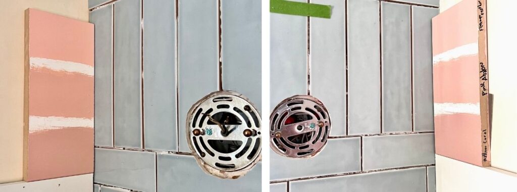
What a difference between the darkest corner and the brightest corner.
Lastly, we painted a larger sample of each on the wall.
Once we painted a sample on the wall, you can really start to see the differences between them.
Sorry, the wall samples are in reverse order to the chips. (Mellow Coral, the right chip is the left wall sample).
Don’t Forget the Lighting-
Light changes our perception of everythign!
Yes, you want to look at the paint in daylight, but don’t forget cloudy days. And nighttime under all artificial light. And with most rooms, you’ll have a combination of natural and artificial light a good part of the time.
And here’s where it can get even crazier. Your lightbulbs matter!
Our light fixtures have been down due to tiling the wall. So for artificial light we’ve been using my ring tripod. This ring light has a spectrum of five different temperatures of light (the Kelvin ratings) as well as a brightness setting too.
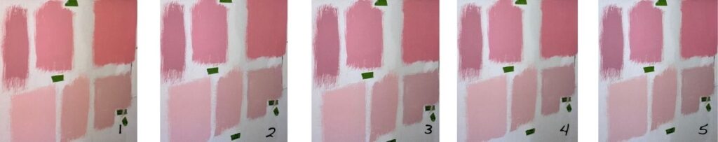
Here is the same wall, same camera settings just taken at each different temperature level of my ring light. Such a difference!
No. 1, the left most image, is at the warmest setting with No. 5, on the right, at the coolest setting.
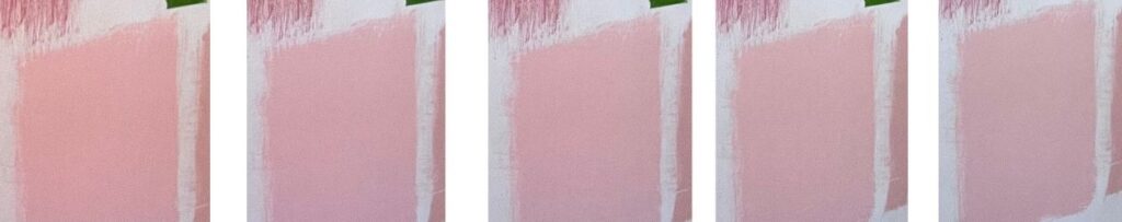
Here are the same images just cropped in on the lightest color so you can better see the impact of the light bulb temperature. Again, warmest to coolest, left to right.
And here’s the difference on more vivid colors.
IMPORTANT NOTE: These images were taken in daylight, which worked to dilute the differences in the light. Seen at night, as the only light source, the change in colors was astounding. However, shooting the photographs did not work because of the required flash.
So be sure to evaluate your paint choices under the light you plan on using.
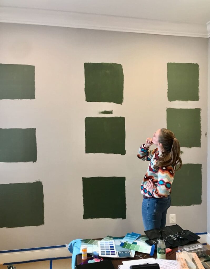
Here’s another example of the impact of light. We were helping our daughter with a feature wall in their new home. She selected three chips that we sampled. The Hubs painted each of the three colors in a vertical column.
This gave our daughter a good idea of what each would look like under the warm pot lights they have in the ceiling (top row), natural light streaming in through the large window on the left (middle row), and in darker light down below the window height (bottom row).
I know, paint colors can be overwhelming!
So please pin this somewhere that you will find it the next time you are heading down this road.
Pin it to your Paint Board
Your DIY Tips Board, or your
Dream House Board, or your
Color Board
And many thanks, Pinning this also helps others find it and I truly appreciate that and you!
Color theory is quite the rabbit hole, that can quickly become a sink hole. But you don’t really need to know the proper terms.
Just be sure to evaluate what you want from the room color. It took me a bit to get there. But once I knew we wanted a soft true coral, rather than a beautiful vivid high-energy coral (which I love and may use somewhere else in the house — as a small accent).
And start with lots of paint chips, narrow down to samples and evaluate under your many light conditions. Then go with what makes your hear sigh or sing, depending on your goal.
Hope this helps you find the shade you need to be your happiest!

This is so helpful to my situation at the moment, thank you. On another note – would you mind also letting me know the font that is used in “here’s to joy-filled living” Diane. So many thanks. Suzanne
Oh, I’m so glad it has been helpful for you! I’d love to hear more about what you are working on and I’m a sucker for a good before & after!
That font is Fresh Script that I bought many years ago through one of the online font suppliers. So sorry, I wish I could remember where exactly.
This was so helpful! Thank you!